I recently picked up my daughter from a rowing competition and the first thing she said was, “Mom, I’m starving. Can we get a smoothie from Smoothie King?” My initial reaction was to use the existing mobile app to order her smoothie so it would be ready for pickup. I quickly realized the current app didn’t have that capability. The following project is a Smoothie King Customer facing ordering mobile app project I worked on with 2 other team members. As Smoothie King customers, we noticed a need for a customer facing ordering app to expedite the ordering process and reduce customer wait time. Ordering on the mobile app would have expedited the ordering process and reduced wait time with my hangry teenager.
The Smoothie King project ordering app began with the initial identification of the gap in the current Smoothie King mobile app for mobile ordering. We defined the initial opportunity by establishing the vision, description, details (high-level functions), differentiators, potential value, and known competitors for the product. We conducted user research, designed and built the product and performed usability testing of the product.
User Research
User research consisted of conducting stakeholder interviews, interviewing current Smoothie King customers, heuristic inspection of competitor apps and comparative analysis of gaps in competitors products. Some potential competitors were Jamba Juice, Starbucks and Papa John’s Pizza. Observations of user research revealed good patterns such as consistency in colors and fonts, layout of screens and relevancy of information architecture. Negative patterns identified consisted of inconsistent or non intuitive navigation and the inability to save customized favorites.
Epics and User Stories
The design phase began with the identification of Epics and User stories. We established our epics by identifying the desired functionality of the app. Epics consisted of
• As a Smoothie King customer I want login options for the Smoothie King iOS mobile app.
• As a Smoothie King customer I want to place my order using the Smoothie King iOS mobile app.
• As a Smoothie King customer I want to pay for my order using the Smoothie King iOS mobile app.
• As a Smoothie King customer I want robust account options for the Smoothie King iOS mobile app.
Our user stories were developed from our epics and grouped accordingly. We tracked our project in Taiga. Some examples of user stories are:
As a Smoothie King customer, I want to be able to reorder a previously placed order.
As a Smoothie King customer, I want to add my favorite items to my order.
As a guest, I want to add my favorite items to my order.
As a customer, I want to use apple pay to pay for my order.
As a Smoothie King customer, I want to save my credit card information to pay quickly at checkout.
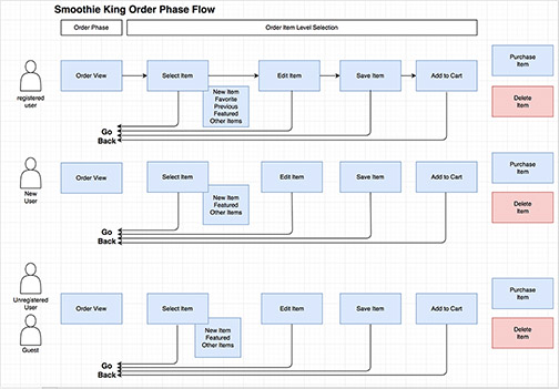
Workflows
We divided the functionalities and processes from the user stories and each team member created workflows for each user type and process. I initially worked on the order view for the app.
This is a workflow example from the ordering portion of the app defining the process for each user type.
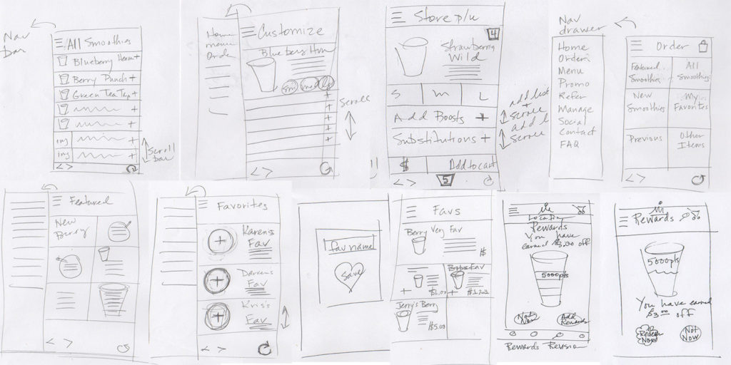
Sketches
Sketching was a vital portion of the design, and for me, one of my favorite parts of the design process. We created abundant sketches for each process of the app. Our team worked individually for sketching and then we came together and practiced elements of a design studio to agree upon specific design elements such as navigation and location selection. We continued to revise our individual sketches and create new sketches as the design process continued. The Rewards sketch included below was created as a result of usability testing results after the initial prototype was tested and revealed issues with the reward screen being perceived as too complicated with too many choices. I created this sketch as our team brainstormed over ways to present the Reward information without overwhelming the user.
Wireframes
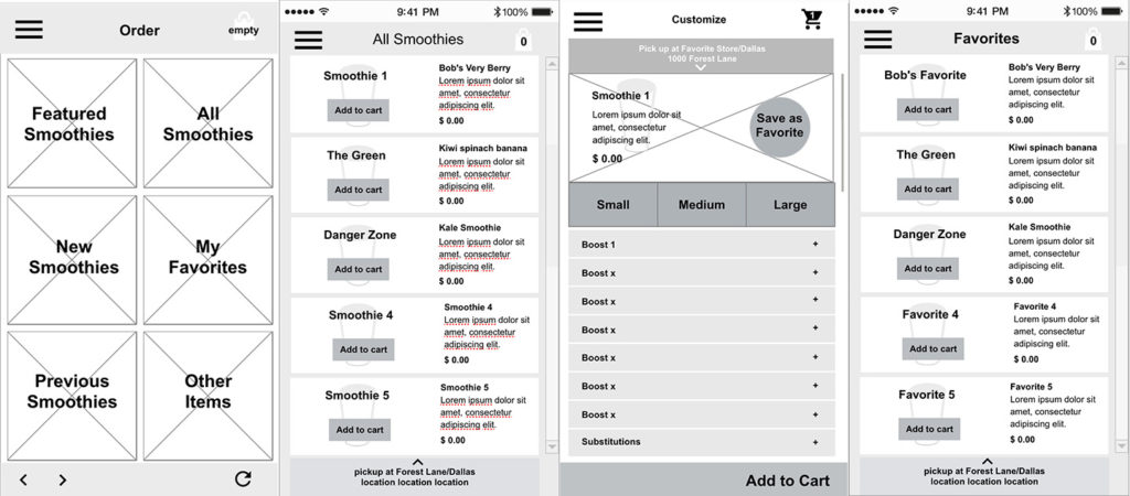
We each created wireframes from our sketches. Once again, we continued to create new iterations to resolve issues of flow, button placement and navigation. We ultimately decided that the location for pickup needed to be displayed at the top to be prominent for the user. Our team used UXPin for creating wireframes and color comps so that we could continue to revise each iteration as a team and share ideas and screens from other team members. These are a few of my wireframes from the initial wireframing process. I continually returned to the sketch process to work through design and usability problems as the wireframing process progressed.
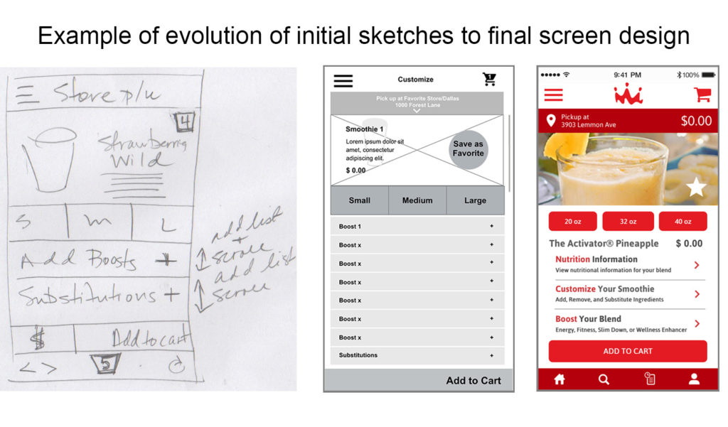
Evolution
Below is an image showing the evolution of the customize order screen as it progressed from the initial sketch to wireframe and ultimately the final color screen. There were several color versions before the final screen design. Our design for the Smoothie King App from the beginning of ideation was the ability to upsell the Smoothie Enhancers. The final screen includes changes to include consistent navigation and reduction of headers to additional screens for nutrition, customization and “boosting” options to upsell the product. The size buttons were lowered on the screen after this color comp to make the screen more thumb zone friendly.
Usability Testing
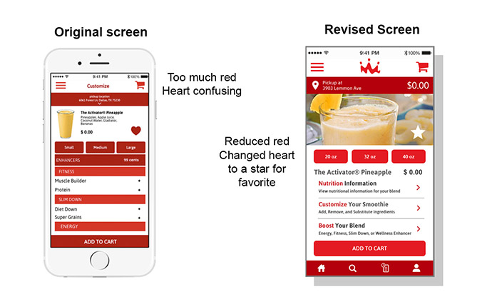
One of our biggest challenges was working within the confines of the current Smoothie King branding and existing app. The Smoothie King brand consists of 2 different colors of red which became a challenge so as to not overwhelm the design. Ultimately, usability testing determined that too much red was used in the initial screens. Here are the findings from our usability testing scenarios.
- Too much red throughout the app (MAJOR)
- Confusion about enhancers (what they are, availability, and cost) (MAJOR)
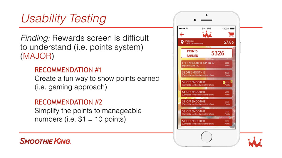
- Rewards screen is difficult to understand (i.e. points system) (MAJOR)
- Unclear on function of “Add Rewards” button (Minor)
- Some confusion on what the favorites button was (Minor)
Here are some of the changes we made based on our usability testing results.
- Use red for primary buttons only.
- Reduce the number of headers and use secondary screens.
- Changed the rewards screen to offer fewer choices. User can either use rewards or exit rewards.
- We added an illustration intended to ultimately become a cup filling animation to represent awards.
This shows the original Rewards Screen which was determined to be extremely confusing to users. Sometimes watching the expressions on a users face can explain even more than their words. All users appeared struck by absolute overwhelming confusion.
Here is the evolution of the Rewards Screen from the initial color comp, testing, return to the drawing board and the final rewards screen. I was trying to think outside of the box, or stripes in this case, to create something more pleasing and fun for the user. I suggested we use a cup illustration or animation to show reward point levels to show what was available for use. Below is the process of how we arrived at the final rewards screen. This illustration is intended to be developed into an animation that will fill with smoothie to reflect the current rewards level to add an element of fun to the user experience.

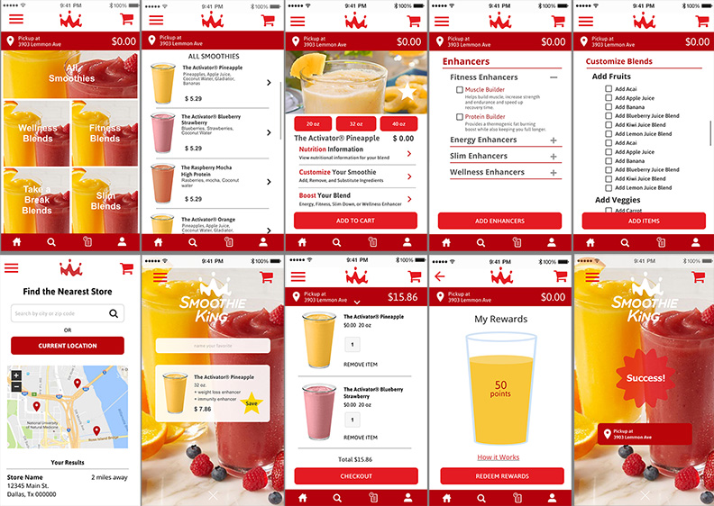
Final Screen Examples
The final prototype was modified to accommodate the final design changes from the testing. Representative screens from the final screens are included below. The enhancers and Add Ingredients screens became new screens to reflect results from usability testing. The use of red was reduced and limited to action items. Navigation was standardized throughout the app.
Additional changes can be made as we continue to test and review the final designs.